
In today’s competitive e-commerce landscape, a seamless shopping experience is paramount to success. A key factor in achieving this lies in optimizing your online store navigation. Effective navigation allows customers to effortlessly browse your products, find what they need quickly, and complete their purchases with ease. This translates directly into increased conversion rates, reduced bounce rates, and ultimately, a thriving online business. This article will delve into the essential strategies and best practices for enhancing your online store navigation and creating a user-friendly interface that fosters customer satisfaction and boosts sales.
From intuitive menu structures and faceted search to optimized product categorization and prominent search bars, we will explore the critical components of a well-designed online store navigation system. By implementing these techniques, you can transform your e-commerce platform into a customer-centric haven, making it easier for shoppers to discover products, compare options, and complete their purchases. Investing in user experience, particularly in navigation, is an investment in the future of your online store. Read on to discover how to optimize your online store navigation for a seamless shopping experience and drive significant business growth.
Understanding the Importance of Intuitive Navigation
In the competitive landscape of e-commerce, intuitive navigation is paramount to success. A seamless browsing experience directly impacts customer satisfaction, conversion rates, and ultimately, your bottom line.
Think of your website navigation as a roadmap guiding customers through your online store. If this roadmap is confusing or difficult to follow, customers are likely to become frustrated and abandon their shopping carts. Effective navigation allows shoppers to effortlessly find the products they’re looking for, encouraging exploration and boosting sales.
Clear and concise navigation minimizes friction in the buying process. When customers can quickly locate desired items, they are more likely to complete a purchase and return for future shopping. Conversely, a poorly designed navigation structure can lead to lost sales and a negative brand perception.
By investing in user-friendly navigation, you create a positive user experience that fosters customer loyalty and drives business growth.
Creating a Clear and Organized Menu Structure
A well-structured menu is the backbone of effective online store navigation. It acts as a roadmap, guiding customers to their desired products quickly and efficiently. A logical hierarchy is crucial, grouping similar product categories together under broader headings. This allows customers to easily browse and drill down to specific items.
Keep menu labels concise and descriptive, using terminology that your target audience understands. Avoid jargon or internal company language. Clarity is key – customers should immediately understand what each menu item represents.
Consider using mega menus for stores with extensive product catalogs. Mega menus allow you to display multiple subcategories and even featured products within a single dropdown, providing a more comprehensive view of your offerings without overwhelming the user.
Limit the number of top-level menu items to avoid clutter and confusion. Too many choices can paralyze users and make it difficult to find what they’re looking for. Strive for a balance between comprehensiveness and simplicity.
Finally, ensure your menu is responsive and adapts to different screen sizes. A mobile-friendly menu is essential for providing a seamless browsing experience on smartphones and tablets.
Implementing Effective Search Functionality
A robust search bar is crucial for a positive user experience. Placement is key; ensure it’s prominently displayed, typically in the header. Functionality should be comprehensive, allowing searches by product name, SKU, and relevant keywords. Consider incorporating autocomplete suggestions to guide users and reduce typos. Advanced search options, while not always necessary, can be beneficial for niche stores or those with a vast product catalog.
Search results should be relevant and well-organized. Clearly display the number of results found. Implement faceted search to allow users to refine their results based on specific criteria like price, brand, or size. Provide sorting options within the search results page to further enhance the user experience. Most importantly, ensure the search function is fast and accurate to minimize user frustration.
Optimizing Product Filtering and Sorting Options
Effective filtering and sorting are crucial for helping customers quickly find desired products. A well-implemented system reduces frustration and improves the overall shopping experience. Provide a wide range of filtering options relevant to your product catalog. This might include categories like size, color, price, brand, material, and other specific attributes.
Intuitively labeled filters are essential for usability. Avoid jargon or technical terms that customers might not understand. Clearly indicate the active filters and allow users to easily remove or modify their selections.
Offer multiple sorting options beyond the standard “featured” or “newest” choices. Allow customers to sort by price (low to high, high to low), popularity, customer rating, or other relevant criteria. This empowers users to control how products are displayed, catering to individual preferences and shopping needs.
Ensure fast loading times for filtered and sorted results. A slow response can deter customers and lead to abandoned searches. Regularly test and optimize your site’s performance to maintain a smooth and responsive filtering experience.
Using Breadcrumbs to Enhance User Journey
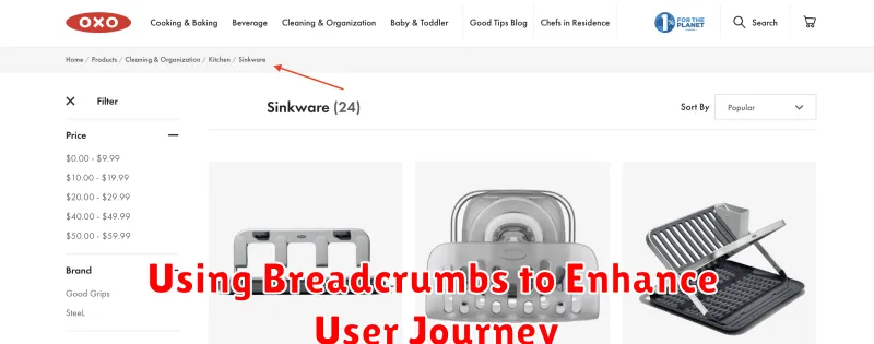
Breadcrumbs are a navigational aid that shows users their current location within a website’s hierarchy. They provide a visual trail of the pages visited, from the homepage to the current page. This simple yet effective tool significantly improves user experience by offering context and facilitating easy navigation.
Benefits of Breadcrumbs:
- Improved User Orientation: Breadcrumbs help users understand where they are within the website’s structure, preventing disorientation.
- Simplified Navigation: They allow users to quickly jump to higher-level categories without relying on the “back” button.
- Reduced Bounce Rates: By providing clear navigation, breadcrumbs help users find what they’re looking for, reducing the likelihood of leaving the site.
Implementation Tips:
- Clarity: Keep the breadcrumb trail concise and easy to understand. Use clear and descriptive labels for each level.
- Hierarchy: Accurately reflect the website’s structure. The breadcrumb trail should follow the logical path from the homepage to the current page.
- Visual Design: Use visual cues such as separators (e.g., “>” or “/”) to clearly distinguish levels within the breadcrumb trail.
Mobile-Friendly Navigation for On-the-Go Shoppers
In today’s mobile-first world, ensuring your online store navigation is optimized for smaller screens is crucial. Mobile users expect a seamless and intuitive browsing experience. A cumbersome interface can lead to frustration and abandoned carts.
Consider a “hamburger” menu to condense navigation options and save valuable screen real estate. This collapsible menu keeps the interface clean while providing access to all essential categories.
Large, touch-friendly buttons are essential for easy navigation on touchscreens. Avoid small, fiddly buttons that can be difficult to tap accurately. Prioritize clear, concise labels for each navigation element.
Minimize page load times for mobile users. Optimize images and code to ensure quick loading, even on slower connections. A slow-loading site can quickly deter mobile shoppers.
Accessibility Considerations for Inclusive Design
Creating an inclusive online store benefits everyone. Accessibility features improve navigation for all users, not just those with disabilities. Consider these key elements when designing your store’s navigation:
Keyboard Navigation: Ensure all interactive elements, including menus, buttons, and forms, are accessible using the keyboard alone. This is crucial for users who cannot use a mouse.
Screen Reader Compatibility: Use semantic HTML and ARIA attributes to provide descriptive labels and instructions for screen readers. This allows users with visual impairments to understand the navigation structure and interact with your store effectively. Clear and concise link text is also essential.
Sufficient Color Contrast: Maintain adequate contrast between text and background colors. WCAG (Web Content Accessibility Guidelines) recommendations provide specific ratios for optimal readability.
Avoid Flashing Content: Content that flashes rapidly can trigger seizures in some users. Minimize or eliminate flashing elements entirely.
Testing and Refining Your Navigation for Optimal Performance
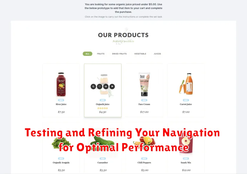
Testing your online store’s navigation is crucial for ensuring a smooth and enjoyable shopping experience. Employ a variety of testing methods to gain comprehensive insights.
Usability testing with real users is invaluable. Observe how users interact with your navigation, identify pain points, and gather feedback on their experience. Consider A/B testing different navigation structures or labels to determine which performs best.
Analytics tools provide valuable data on user behavior. Track key metrics such as bounce rate, exit rate, and time spent on site to identify areas for improvement. Analyze user flow reports to understand how users navigate through your site and pinpoint any bottlenecks or drop-off points.
Regularly refining your navigation based on testing data is essential. Implement changes incrementally and continue to monitor performance. This iterative process will help you optimize your navigation for maximum effectiveness and create a seamless shopping experience for your customers.